We all make decisions based on risk throughout our lives. In some cases these choices are relatively simple, such as choosing when to cross the road based on your observations of the presence and speed of oncoming traffic.
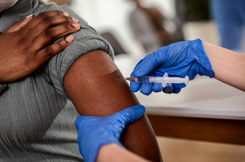
But it can be difficult to make decisions about risk when the enemy is invisible, and you know very little about how it could affect you. This was the case for many of us when COVID-19 hit the UK back in March.
To help people understand their risk, the government published a list of groups of people who may be more severely affected by the virus, including those over 70 and people with underlying health conditions such as cardiovascular disease, high blood pressure, obesity, diabetes, and respiratory illnesses.
Although the advice seemed clear on paper, many people were confused about how much risk the virus posed to them personally, and how much action they should take to avoid it. Dr Ami Banerjee, associate professor at University College London, and honorary consultant cardiologist at University College London Hospitals, experienced this confusion first-hand in his clinic.
“I saw a patient in my heart failure clinic who couldn’t understand why I had been saying for years that he was much fitter than me, but was now telling him he was in a high-risk category,” Ami says.
It was clear that people wanted better, more personalised information about their risk from COVID-19, so he went home and started brainstorming how he could use the available data resources to bring relevant information about risk to the public.
First, Ami and his collaborators from UCL, Oxford University and Cambridge University used the HDR UK–CALIBER open online portal to link up electronic health records from 3.8 million people from England to find out how many people fell into one of the high-risk groups for COVID-19.
Ami, who was surprised to discover that such a high proportion of the population were in this category, said:
“We found that 1 in 5 people were in one of the risk groups listed by Public Health England,”
Next, they used data about deaths in previous years to calculate how likely a person is to die in the following year based on age, sex and underlying health conditions in the absence of the pandemic.
“Then we used that hard data about baseline mortality, together with assumptions about policy scenarios and infection rates, to estimate the risk to different groups from COVID-19,” Ami explains.
“We did some modelling that showed that if the infection rate for COVID-19 rose to 10% or more, then we could be looking at tens of thousands of deaths across the country.”
This seemed extreme compared with previous predictions, especially given that COVID-19 cases in the UK had not yet hit 2,000 with fewer than a hundred deaths recorded, But those previous models hadn’t included factors such as the prevalence of high-risk conditions and pre-COVID mortality rates.
The work done by Ami and his team helped the government decide to take drastic action against the virus.
“We published our data as a preprint and shared it with Health Data Research UK and the chief medical officer on the 22nd of March. Then the following day we went into lockdown,” Ami says.
Their full findings, which were published in The Lancet in May, showed that the risk of death during the pandemic varied significantly depending on the number and type of underlying health conditions an individual has.
For example, a person with heart disease is five times more likely to die in the following year than a healthy person, but a person with both heart disease and diabetes is ten times more likely to perish during the pandemic than someone with neither condition.
This was information that Ami felt needed to be available to the public, so they could understand their personal risk and inform their decisions and behaviour.
“Patients and the public told us that they wanted this information so they could have conversations with their family and care team about their risk,” says Ami.
“We released a calculator which took our assumptions around relative impact and infection rates and allows people to put in their age, sex, and underlying health problems. It tells you the number of people like you in England, the baseline mortality, and the number of excess deaths there might be in that category depending on how much the virus spreads,” explains Ami.
Given the public interest, the team also sought rapid input from HDR UK’s Patient and Public Involvement Group, which helped to shape the project. The prototype risk calculator went live at the end of May, gaining more than a million views in the first month.
Ami and the team are continuing to improve the calculator by adding data about additional health conditions, and are working with patient groups, members of the public, charities and health professionals to make it as useful as possible as we enter the second wave of the pandemic. They aim to make the new version of the calculator available in the next few weeks.
“COVID-19 has meant that we are all having to grapple with risk in a way that many of us have never had to before,” he says. “We want to help people understand more about their own personal risks, so they can make informed decisions about their health.”
Read more: